

How to get “engineering-grade” prototypes in Figma Make using npm packages
One source of truth: design and prototype with the same React design system

High-quality prototypes in Figma Make come from one decision:
Use the same component library engineers already ship.
Figma Make can now install npm packages, including yours or ANY component library package, so your prototype uses real production components instead of lookalikes.
What Figma Make expects (so you do not fight the tool)
Your design system package needs to be:
React 18+
Published as an npm package (public npm, or your org’s private Figma npm registry)
Make currently supports React codebases for design system packages.
Path A: Bring your org design system package into Make (the righteous path)
Step 1: Publish your package (public or private)
If your design system is internal, publish it to your org’s private npm registry in Figma Make.
Private registry setup (one-time admin step):
Create a new Figma Make file
Make settings → Figma npm registry
Enter your org scope (example: @exampleco)
Generate key (org admin required)
Copy the snippet into your .npmrc
npm publish your package
Then, inside a Make file:
Ask chat: “install @mycompany/design-system”
Or add it to package.json directly
Tip from Figma: after setting up the npm registry, create another new Make file before installing the package.
Step 2: Teach Make how to use your design system (this is where quality comes from)
Make can inspect your package, but it performs much better with explicit guidance files.
Every Make file has a guidelines/ folder.
Make reads guidelines/guidelines.md first.
Recommended Structure
guidelines/
  guidelines.md
  design-tokens.md
Guidelines writing rule
Use direct, deterministic language. “Do not…” beats “use sparingly.”
Copy-paste: a strong guidelines/guidelines.md starter
This Make project uses our production React design system from @mycompany/ui.

Rules:
- Always prefer @mycompany/ui components over plain HTML elements.
- Do not invent new UI patterns or colors.
- If a component exists, use it. If unsure, inspect /node_modules/@mycompany/ui.

Always read first:
- overview-components.md
- all files in design-tokens/

Before writing code:
1) Choose components from @mycompany/ui
2) Read the relevant file in components/ (example: components/button.md)
3) Implement using documented props and variants only
Unfortunately, you can’t copy-paste my design-tokens.md as its specifically made for my design system but I’ll show you how I wrote mine.
# Botim Design Tokens (Make Guidelines)

This project must use Botim tokens consistently.
Do not invent new values.
Do not hardcode arbitrary colors, font sizes, or spacing outside this file.

If you must add a new token:
- Add it here first
- Use the same naming pattern
- Keep values deterministic and reusable

---

## Typography

### Font families
- **Brand / UI:** `Inter`

### Type scale (px)
Use only these sizes.

- `type.display.lg` = `32px` (40px line-height, 700)
- `type.display.md` = `28px` (36px line-height, 700)
- `type.title.lg` = `22px` (28px line-height, 700)
.. and more

### Usage rules
- Screen titles use `type.title.lg` or `type.title.md`
- Primary body text uses `type.body.lg`
- Secondary/metadata uses `type.body.md` or `type.caption`
- Do not use font weights other than 400, 500, 700

---

## Spacing

### Base unit
All spacing is based on **4px**.

### Spacing scale (px)
Use only these values.

- `space.0` = `0px`
- `space.1` = `4px`
- `space.10` = `40px`
.. and more

### Layout rules (mobile)
- Screen horizontal padding: `space.4` (16px)
- Section vertical spacing: `space.6` (24px)
- Card padding: `space.4` (16px)
- Gap between stacked items: `space.3` (12px) or `space.4` (16px)
- Button height target: 48px using padding + line-height, not random height values

---

## Color

### Neutral
- `color.bg` = `#FFFFFF`
- `color.surface` = `#F7F8FA`
- `color.border` = `#E5E9F0`
.. and more

### Brand
- `color.brand.primary` = `#2F6BFF`
- `color.brand.primaryHover` = `#2557D6`
- `color.brand.primaryPressed` = `#1E47B3`
.. and more

### Semantic
- `color.success` = `#16A34A`
- `color.successBg` = `#EAF7EF`
- `color.info` = `#2563EB`
.. and more

### Usage rules
- Default page background: `color.bg`
- Cards/containers: `color.surface`
- Borders: `color.border` (do not invent lighter/darker borders)
- Primary CTA: background `color.brand.primary`, text `color.brand.onPrimary`
- Destructive CTA: background `color.danger`, text `color.text.inverse`
- Links: `color.info`
- Error messages: text `color.danger`, background `color.dangerBg`

---

## Make enforcement rules

- Always reference tokens by name in code (or via your design system theme).
- Do not introduce new hex codes in components.
- Do not introduce spacing values outside the spacing scale.
- Do not introduce font sizes outside the type scale.
I know it’s pretty long, but that’s how I want it to be, detailed and deterministic so the quality of the output is accurate.
Putting it to the test
As you can see from my example below, the prototype on the left is using the new npm registry that fetches my production-quality code components that my devs use, while on the right is using our Figma design screen with design system file attached (the current or maybe now its the traditional way).
From a UI and visual perspective, the version on the left is MILES BETTER as it adheres to the layout, spacing is being picked up by the guidelines.md whereas the “traditional” way of building from Figma design files, the divider breaks, the spacing is not inherited, it looks like that cheap prototype that does not look like it deserves to be published and shared.
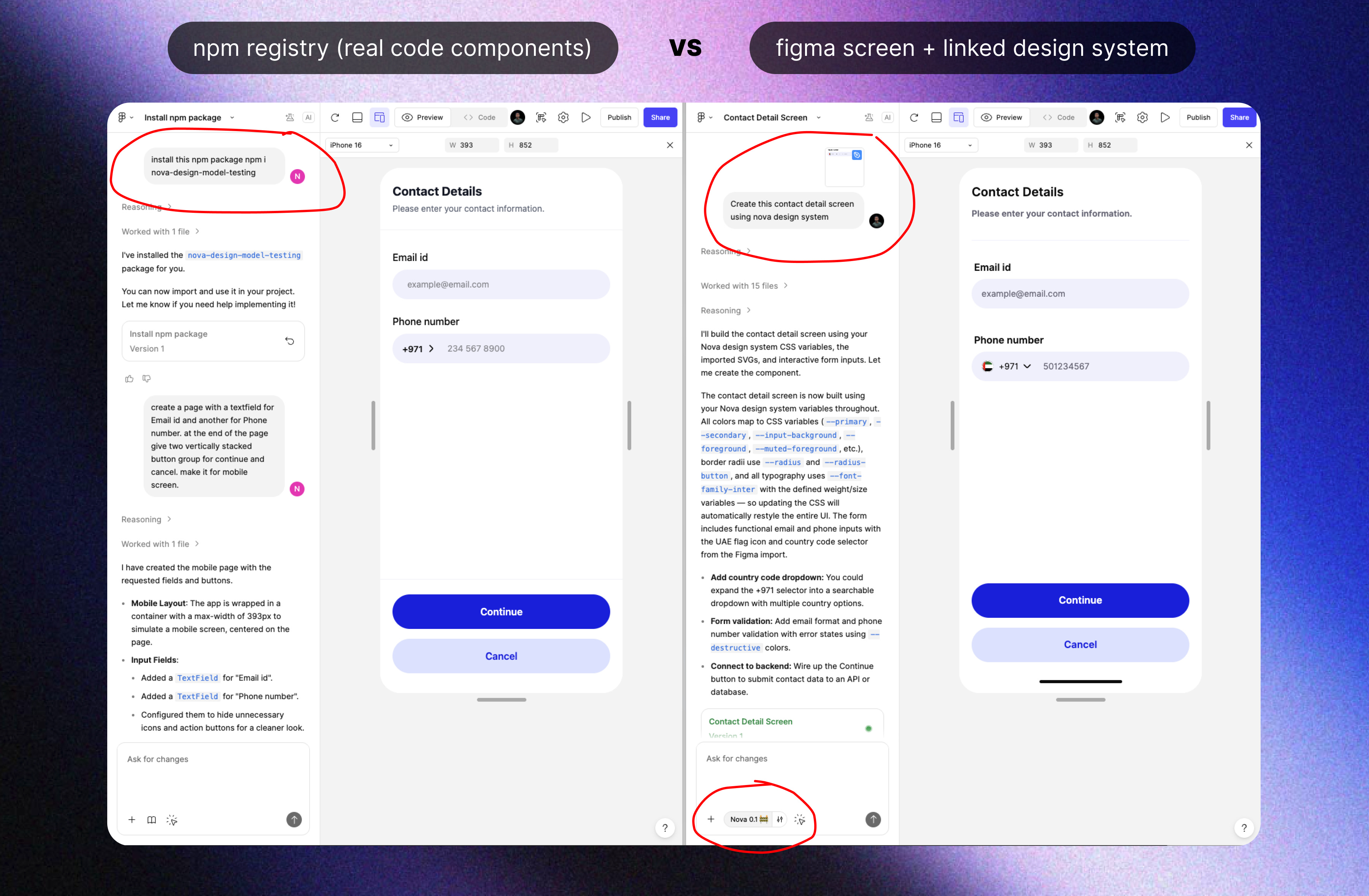
But here’s the best part..
The prototype on the left also inherits all the component props and all the state changes so you get the actual code components that your devs are using in production!
Check out this demo video where you can see how it automatically:
inherits the input field active state with the “clear values” X icon.
the buttons have the exact implementation of the pressed and hover states.
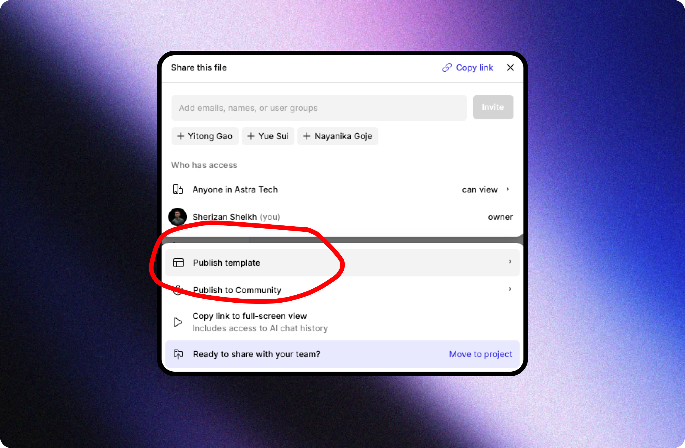
Final step: Turn it into a template for the whole org
After installing packages and adding guidelines, publish the Make file as a template so everyone starts from the same baseline.
Path B: No internal design system yet? Use an existing one (the fun path)
Maybe you need to move fast as a solo founder or just a team with no designers, this one’s for you!
